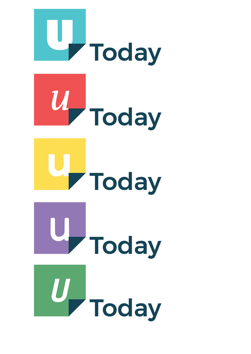
Logo entry in a competition to create a new logo for U-Today. U-Today is an independent university paper that writes for students and people working at University of Twente. A new brand image was introduced that required a new logo. U-Today wanted to be seen as independent and show that they are not there only for the students.A simple logo was created that focuses on readability and recognisability. This comes back in the few colors used for the design and the easy readable font.The logo entry focuses on the fact that the articles are readable on internet and in printed paper. This can be seen in the (mouse) arrow that doubles as a turned corner of a page. Additionally, the U in U-today reflects that the paper is for everyone. To make the U more personal the color of the block and the font of the U can be altered . This can be done randomly for every refresh on the site or every author of the paper chooses his or her own design.
The U-Today Logo
Elements of the logo
Dimensions of the logo (left) & vertical variation of the logo (right)
Personalised variations of the logo (left) & additional color schemes (right)